
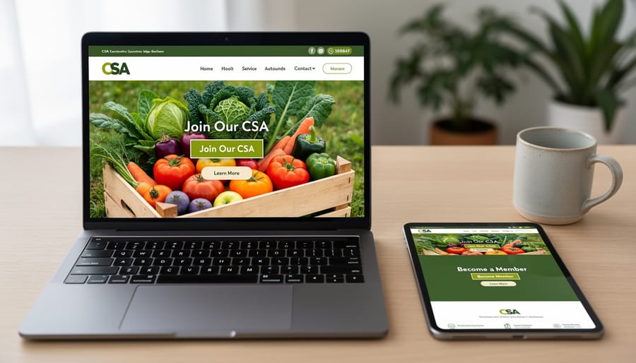
Place a bright “Join Our CSA Today” button above the fold on your homepage where visitors can see it within three seconds of landing—this single change can boost signup rates by up to 40% for small farms. Your call-to-action (CTA) is the bridge between interested visitors and committed CSA members, yet most farm websites bury these crucial conversion points in dense paragraphs or place them where nobody clicks.
Transform your farm’s online presence by treating CTAs as digital farm stands—clear, inviting, and impossible to miss. Unlike corporate marketing, CSA farms have a unique advantage: you’re offering real relationships with real farmers, fresh weekly harvests, and a tangible connection to the land. Your CTAs should reflect this authenticity while making the signup process effortless.
Consider how Green Valley Farm in Ontario increased their CSA membership by 65% in one season simply by adding action-oriented buttons throughout their website and email campaigns. They replaced vague links like “Learn More” with specific prompts like “Reserve Your Share for Spring” and “Get Farm-Fresh Eggs Delivered.” These weren’t aggressive sales tactics—they were helpful guideposts for people already interested in supporting local agriculture.
Effective digital marketing strategies for CSA farms hinge on understanding that your audience wants to say yes—they just need clear direction on how. This guide will show you exactly how to create CTAs that convert curious visitors into loyal CSA members while staying true to your farm’s values and community-focused mission.
What Makes a CTA Work for CSA Farms (Hint: It’s Not Just a Button)
The Difference Between Generic and CSA-Specific CTAs
Generic CTAs like “Learn More” or “Click Here” are the marketing equivalent of saying “something’s here” without explaining what makes it special. For CSA farms, these vague phrases miss the opportunity to connect with your community’s unique interests and concerns.
Instead, craft CTAs that speak directly to what your members care about. When someone visits your CSA website, they’re wondering about harvest timing, getting to know who grows their food, and understanding what they’ll receive. A CTA like “Reserve Your Summer Harvest” immediately addresses seasonal planning and creates urgency, while “Meet Your Farmers” builds the personal connection that sets CSAs apart from grocery stores.
Context makes all the difference. Consider the farm that changed their homepage button from “Sign Up” to “Join Our Farm Family for 2024.” Their conversion rate jumped because the new CTA emphasized community belonging rather than just a transaction. Another successful example: “Get Your Weekly Veggie Guide” performs better than “Download Now” because it clearly communicates the value members receive.
The key is specificity. Your CTAs should reflect the real reasons people choose CSA membership: fresh seasonal produce, supporting local agriculture, and becoming part of a sustainable food system.
Where to Place CTAs That Actually Get Clicked
Your Homepage: The First Handshake
Your homepage is where potential members first discover your farm, so think of your CTA as a warm, welcoming handshake rather than a pushy sales pitch. Position your primary CTA above the fold—that’s the portion visitors see without scrolling. A clear, action-oriented button like “Join Our CSA Today” or “Reserve Your Weekly Harvest” works beautifully here, paired with a brief sentence explaining the immediate benefit: “Get farm-fresh vegetables delivered every week starting this spring.”
Below the fold, consider softer CTAs that nurture interest without demanding commitment. A newsletter signup with copy like “Get Growing Tips & Farm Updates” invites visitors to stay connected at their own pace. One successful organic farm in Vermont increased signups by 40% by offering a free seasonal planting guide in exchange for email addresses—a gentle way to build relationships before asking for full membership commitments. Remember, your homepage should guide visitors naturally toward action while respecting their decision-making journey.
Blog Posts and Educational Content
Your blog content offers the perfect opportunity to naturally guide readers toward membership. When sharing a seasonal recipe featuring heirloom tomatoes, include a simple CTA like “Join our CSA to enjoy these varieties in your weekly box.” This feels organic because readers are already imagining the produce.
Farming updates work beautifully for CTAs too. After describing your recent strawberry harvest, add “Reserve your share for next season’s berry bounty.” This creates excitement and urgency without feeling pushy.
Gardening tips attract engaged readers who value growing food. When explaining crop rotation techniques, try “Want expert-grown organic produce without the guesswork? Our CSA delivers weekly.” This acknowledges their interest while offering a solution.
The key is matching your CTA to the content context. Educational posts build trust, making readers more receptive when you invite them to take the next step. These CTAs complement your broader digital marketing channels by converting curious visitors into committed members. Keep CTAs concise, relevant, and focused on the value members receive rather than just asking for a purchase.
Farm Visit and Market Pages
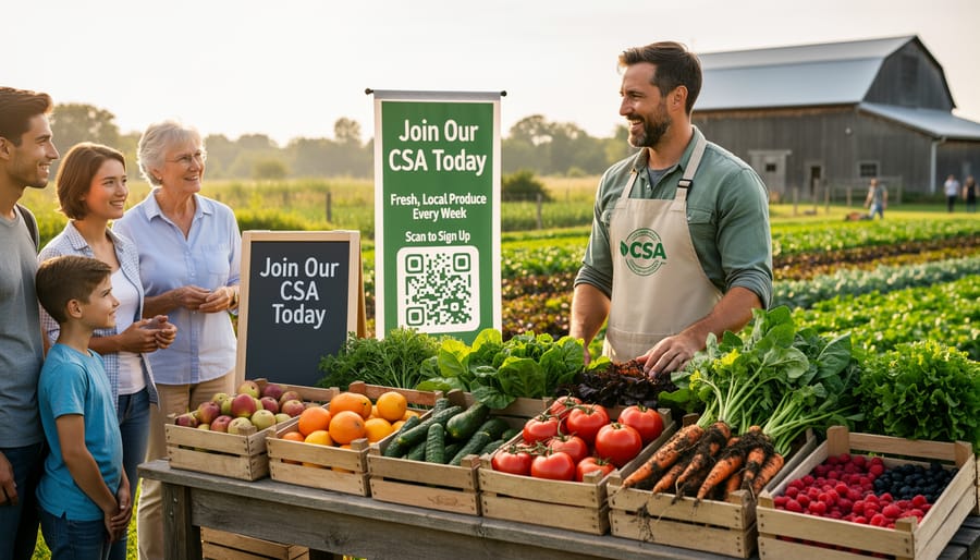
Your farm visit and market pages naturally attract engaged community members who are already curious about your operation. This is prime real estate for strategic CTAs that guide visitors toward membership. After listing your farmers market schedule, add a simple button: “Reserve Your Weekly Box – Skip the Market Rush!” This taps into convenience while maintaining that personal connection. On farm tour pages, include CTAs like “Loved What You Saw? Join Our Farm Family Today” immediately following visit details. Consider adding a seasonal urgency element: “Only 15 Spring Shares Remaining” creates gentle motivation without pressure. One successful Pennsylvania farmer includes a post-visit CTA offering a 10% discount code for attendees who sign up within 48 hours of their tour, converting that warm in-person experience into immediate action.
Writing CTAs That Speak to Your Community
Use Action Words That Reflect CSA Values
The words you choose for your CTAs can make all the difference in connecting with potential CSA members. Action verbs that reflect community values and sustainable living resonate deeply with environmentally conscious consumers.
Start with “Join” to emphasize the community aspect of your CSA. This simple word invites people to become part of something larger than a transaction. “Reserve Your Share” works beautifully for seasonal signups, creating a sense of exclusivity while highlighting the share-based model.
“Connect With Your Farmer” bridges the gap between producer and consumer, addressing the desire for transparency that many organic food seekers value. For donation or volunteer opportunities, use “Support Local Agriculture” to appeal to community-minded individuals.
“Grow With Us” serves double duty, suggesting both personal growth through sustainable living and the literal growing of your farm community. “Start Your Farm Fresh Journey” works well for newcomers unfamiliar with CSAs.
Other effective phrases include “Discover Seasonal Eating,” “Commit to Local Food,” and “Build Food Security Together.” These action words go beyond simple transactions and speak to the values-driven decisions your target audience makes daily. Choose verbs that feel authentic to your farm’s mission while inspiring immediate action.
Address Common Hesitations Head-On
Potential CSA members often hesitate due to understandable concerns about commitment, variety, and convenience. Your CTAs can directly address these worries with reassuring language that removes barriers to signup. Instead of a generic “Join Now,” try “Start with a Half Share—No Long-Term Commitment” to ease fears about overcommitting. This approach speaks directly to what members look for when considering a CSA investment.
For variety concerns, CTAs like “Get 15+ Different Vegetables Weekly” or “See This Week’s Harvest” provide concrete details that build confidence. Address pickup logistics head-on with phrases such as “Three Convenient Pickup Locations” or “Switch Your Pickup Day Anytime.” Consider seasonal flexibility too—”Join Anytime, Cancel Between Seasons” respects members’ need for control.
Successful farmer Melissa from Green Valley Farm increased signups by 40% after adding “First Box Free if You’re Not Delighted” to her main CTA. This guarantee-style language transforms risk into opportunity. Remember that building community connections starts with trust, and your CTAs should reflect that understanding by acknowledging real concerns while offering practical solutions.
Create Urgency Without Sounding Pushy
Creating urgency in your CTAs doesn’t require aggressive sales language. Instead, align your messaging with the natural rhythms of farming to create authentic scarcity. For example, “Spring Shares Filling Fast – Reserve Your Spot by March 15th” works because it reflects reality: you genuinely have limited shares available based on your planting capacity.
Frame deadlines around agricultural milestones that your audience understands. Try “Lock in Your Summer Harvest – Planting Starts April 1st” or “Final Week to Join Our Fall CSA Before Seed Orders Close.” These create legitimate time pressure while educating members about farm operations.
Share real updates that build natural urgency: “Only 8 shares remaining for this season” or “We’re at 75% capacity for our winter CSA.” Transparency about your actual numbers builds trust while encouraging action.
Seasonal language resonates particularly well. “Get Fresh Strawberries This June – Spring Shares Closing Soon” connects the signup deadline to something members can taste and anticipate. One Massachusetts farm saw a 40% increase in signups by simply adding “Don’t miss tomato season” to their summer CTA, reminding people what they’d be missing. Authentic urgency respects your audience while motivating timely decisions.
Design Elements That Make Your CTAs Impossible to Miss
Colors, Buttons, and Visual Hierarchy
Your call-to-action buttons should stand out like a vibrant red tomato in a field of green lettuce. For farm websites with earthy tones like greens, browns, and creams, choose button colors that create contrast. Bright orange, deep blue, or bold red work beautifully against natural backgrounds without clashing with your farm’s aesthetic.
Size matters when it comes to buttons. Make them large enough to tap easily on mobile phones, since many customers browse while on the go. A good rule is to keep buttons at least the size of your thumb pad. Place your most important buttons, like “Join Our CSA” or “Reserve Your Share,” above the fold where visitors see them immediately.
White space is your friend. Give your buttons breathing room by surrounding them with empty space, making them impossible to miss. Think of it like proper plant spacing in your garden—crowding reduces impact. Keep your button text short and action-focused: “Get Started,” “Sign Up Today,” or “Claim Your Box” work better than lengthy explanations. Test different colors and placements to see what resonates with your community, just like you’d trial different crop varieties to find what grows best.
Mobile-Friendly CTAs for Market Shoppers
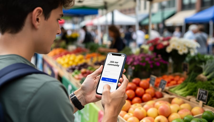
Most of your potential CSA members are discovering your farm while scrolling through their phones at the farmers market or researching dinner options during their commute home. That’s why mobile-friendly CTAs aren’t just nice to have—they’re essential for converting interested shoppers into committed members.
Your CTA buttons need to be thumb-friendly, ideally 44×44 pixels or larger, so people can easily tap them without frustration. Think about those moments when someone’s juggling grocery bags or standing in line—your “Join Our CSA Today” button should be impossible to miss and effortless to click.
Place your CTAs where mobile users naturally look: near the top of your homepage and immediately after compelling content like a farmer success story about this season’s heirloom tomatoes. Avoid tiny text links that require pinching and zooming. Instead, use contrasting colors that pop against your background and create generous spacing around buttons to prevent accidental clicks.
Consider adding quick-action CTAs like “Text Us to Reserve Your Share” or “Call Now for Farm Tour” that leverage smartphone capabilities. When Sarah’s Farm implemented larger mobile buttons and simplified their signup form for phone users, they saw a 40 percent increase in mobile conversions within just two weeks.
Real CSA Success Stories: CTAs That Changed Everything
When Green Valley Farm in Vermont was struggling with only 45 CSA signups in their second season, founder Maria Chen knew something had to change. Her website had a simple “Learn More” button buried at the bottom of her homepage. After attending a local farm marketing workshop, she transformed her approach with a vibrant green button reading “Reserve Your Share of Fresh Organic Veggies Today.” She placed it prominently above the fold and added another at the end of her farm story. The result? Her next season brought 112 signups, more than doubling her membership.
Brookside Community Farm in Oregon faced a different challenge. Owner James Park had plenty of website visitors but few conversions. His generic “Sign Up” button wasn’t creating urgency. He redesigned his CTA to read “Join 50 Families Eating Fresh This Summer” and added a countdown showing spots remaining. He also included a secondary button saying “Take a Virtual Farm Tour First” for hesitant visitors. This two-pronged approach increased his conversion rate by 67 percent, filling his 80-member CSA three weeks earlier than previous years.
Perhaps most inspiring is Sunrise Acres, a small family farm in Pennsylvania. Owner Rachel Thompson had no CTA at all, just her email address listed on a basic webpage. After creating a simple button with the words “Start Your Farm-Fresh Journey” linked to a straightforward signup form, she went from 12 members to 34 in one season. Rachel’s experience proves you don’t need fancy technology or a huge budget. Sometimes a clear, welcoming invitation makes all the difference.
Testing and Tweaking: How to Know What’s Working
Understanding whether your CTAs are working doesn’t require fancy software or a degree in data analysis. Start with the free tools you likely already have access to. Most website builders, email platforms, and social media accounts include basic analytics that show how many people clicked your buttons or links. For example, if you send an email newsletter promoting your summer CSA shares with a “Reserve Your Box” button, check how many subscribers actually clicked it. This simple metric tells you if your message resonated.
Pay attention to conversion rates rather than just total clicks. If 500 people saw your CTA but only 5 clicked, that’s a 1% conversion rate, which suggests something needs adjusting. Try changing one element at a time – maybe swap “Learn More” for “Join Our Farm Family Today” – then compare the results over a week or two.
Sarah, a small-scale organic farmer in Vermont, discovered her signup rates doubled when she tested buttons with warmer language like “Start Your Fresh Food Journey” instead of generic phrases. She simply kept notes in a spreadsheet tracking each version’s performance.
Watch for patterns in timing too. Do CTAs in Tuesday morning emails perform better than Friday afternoons? Does your Instagram story CTA for farm tours get more taps on weekends? These insights help you optimize when and where you place your calls to action. Remember, even small improvements in CTA performance can mean several new CSA members throughout the season, making this simple testing worthwhile for your farm’s growth.
Your CTAs are the digital handshake between curious visitors and committed CSA members. They’re the moment when someone’s interest in fresh, organic produce transforms into real support for your sustainable farming mission. Every button, form, and link on your website holds the potential to grow your farm community and strengthen local food systems.
Take a moment this week to audit your current CTAs. Choose just one to improve—maybe it’s adding urgency to your signup button, creating a mobile-friendly form, or testing a more personal message that reflects your farm’s unique story. Small changes can yield significant results, just like the careful tending of seedlings leads to abundant harvests.
Remember, you’re not just marketing vegetables; you’re inviting people into a meaningful relationship with their food and the land that grows it. Every CSA member who joins through an effective CTA becomes part of your farm’s success story, supporting sustainable agriculture and enjoying the freshest produce their region has to offer.
Your farm has an incredible story to tell and a community waiting to be nurtured. With thoughtful, well-crafted CTAs, you’re building bridges that connect passionate growers with conscious eaters, one click at a time. Start today, and watch your community flourish.